Roland

Joined: May 12, 2004

|
 Posted:
Nov 02, 2015 - 14:58 Posted:
Nov 02, 2015 - 14:58 |
 
|
| WhatBall wrote: | Has anyone made player portraits for these yet?
Please & thanks. |
lineman:
 |
|
|
harvestmouse

Joined: May 13, 2007

|
 Posted:
Nov 02, 2015 - 21:37 Posted:
Nov 02, 2015 - 21:37 |
 
|
Opinions on Roland's outline effect? I'm not sure whether I like it or not. His skin colour looks a little pasty to me. |
|
|
Roland

Joined: May 12, 2004

|
 Posted:
Nov 02, 2015 - 22:15 Posted:
Nov 02, 2015 - 22:15 |
 
|
hmm, perhaps it's better with just a shadow?

Regarding the skin tone, do you know a better color?
currently it's #f7c899 (first one that looked 0k to me, didn't try anyone else). It'll take 5 sec to change it. |
|
|
Roland

Joined: May 12, 2004

|
 Posted:
Nov 02, 2015 - 22:31 Posted:
Nov 02, 2015 - 22:31 |
 
|
I'll admit they look pretty flat... it's just the simplest coloring, nothing fancy.

EDIT: hopefully, someone else can do a better job... |
|
|
Balle2000

Joined: Sep 25, 2008

|
 Posted:
Nov 02, 2015 - 22:46 Posted:
Nov 02, 2015 - 22:46 |
 
|
Definitely works better with drop shadow than stroke. That is also in line with most of the player portraits.
Consider changing to 90 degree light source angle. As you see from the Fling in the second portrait, Knut's illustration already has a shadow from that angle of light (if I'm not mistaking). |
|
|
Mr_Foulscumm

Joined: Mar 05, 2005

|
 Posted:
Nov 02, 2015 - 23:41 Posted:
Nov 02, 2015 - 23:41 |
 
|
Looks great Knut!
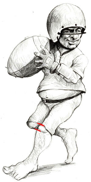
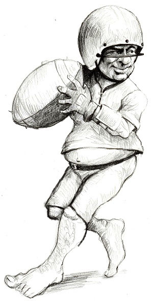
One thing I'd like to point out that would make the Punter much stronger as an image (if he has time to change it of course):
Watch out for the tangents you've created around the knees. The hem of the pants line up as well as the knees themselves. It flattens the image and makes the image harder to read. Like this:

It'd be a more pleasing design if they were shifted of the tangent. Like so:

It might not look like much, but scale down the image and the issues with readability becomes apparent.
Keep up the great work dude!  |
_________________
Everybody's favorite coach on FUMBBL |
|
Roland

Joined: May 12, 2004

|
 Posted:
Nov 03, 2015 - 00:06 Posted:
Nov 03, 2015 - 00:06 |
 
|
| Balle2000 wrote: | Definitely works better with drop shadow than stroke. That is also in line with most of the player portraits.
Consider changing to 90 degree light source angle. As you see from the Fling in the second portrait, Knut's illustration already has a shadow from that angle of light (if I'm not mistaking). |
liek dis?
  |
|
|
harvestmouse

Joined: May 13, 2007

|
 Posted:
Nov 03, 2015 - 00:51 Posted:
Nov 03, 2015 - 00:51 |
 
|
Well halflings are quite healthy and generally referred to as 'ruddy'. I think a little bit more tan and rosier cheeks would make them a bit more 'flingy'.
It'll contrast better with the top colour too. |
|
|
Roland

Joined: May 12, 2004

|
 Posted:
Nov 03, 2015 - 06:31 Posted:
Nov 03, 2015 - 06:31 |
 
|
Ok, i'll see what i can do  |
|
|
|
|

